Fred — Brand story
Paseo
A little color. A lot of life.
The idea
An identity with room to move.
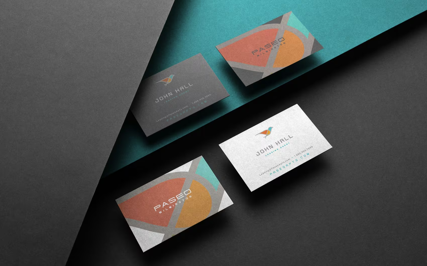
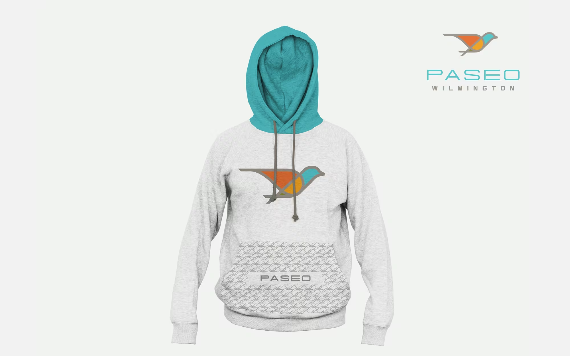
Paseo’s Wilmington identity starts with a bird in flight. The mark brings together coral, turquoise and warm ochre, giving the brand a lively, approachable signature. Against charcoal and white, those colors can play very different roles without losing their connection.
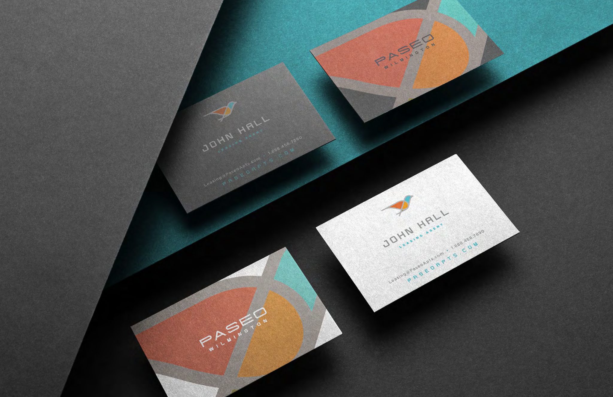
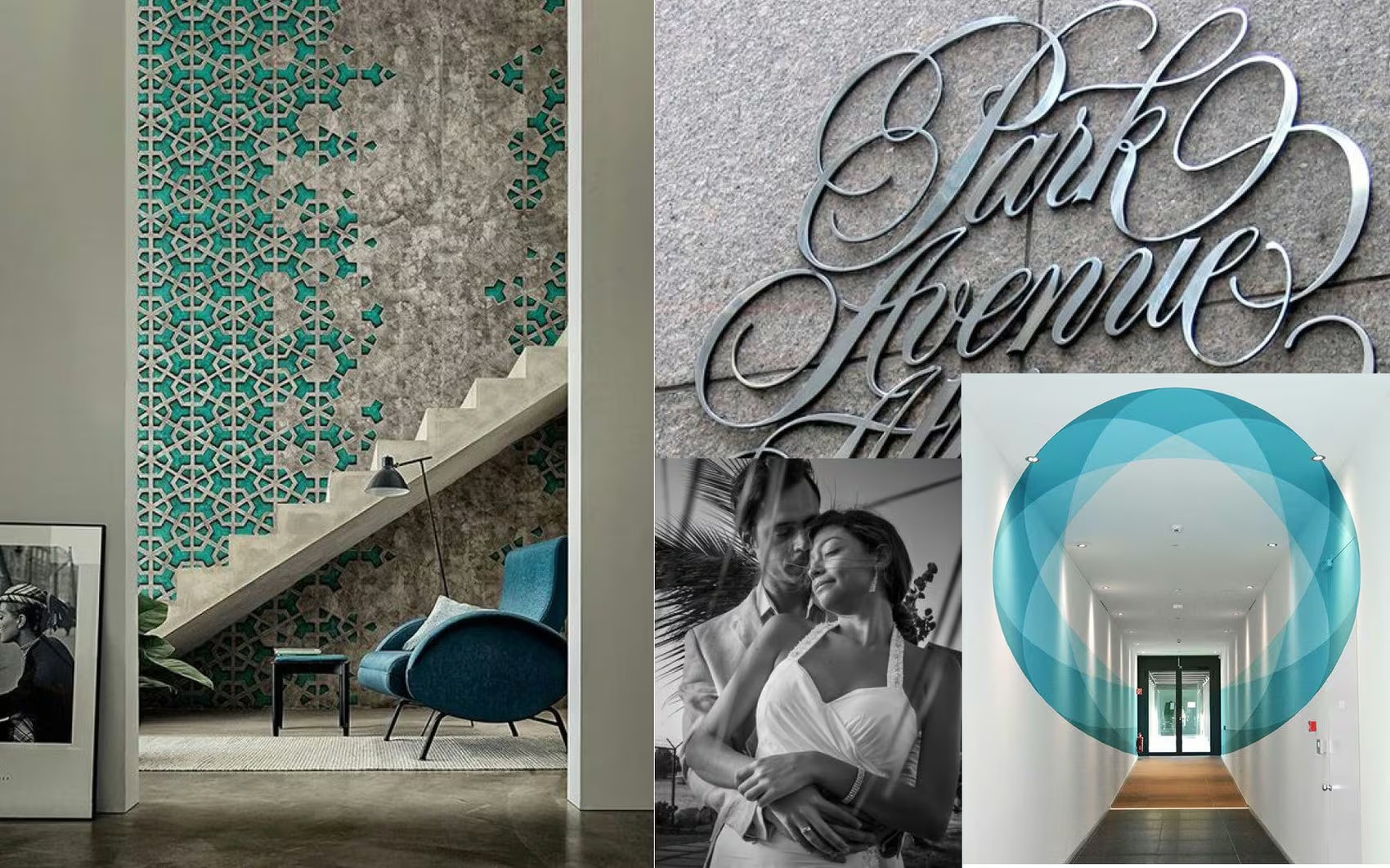
The stationery takes the identity beyond the logo: larger shapes, overlapping color and generous space turn a small printed piece into a more expressive brand moment. Campaign photography then shifts the focus from the identity itself to the life around it.



















The finished system
One identity, across the experience.
The mark, stationery and campaign images work at different scales. Together, they connect a recognizable graphic identity with an invitation to imagine a way of living.